●hover : 선택자 위에 마우스를 올리면 지정한 스타일 서식대로 변화함
active : 선택자를 마우스로 클릭하면 지정한 스타일 서식대로 변화함
->하나의 반응 선택자가 변경하는 사항을 다른 선택자에 적용하려면
"자신의 형제나 후손 선택자에게만" 적용이 가능합니다.
자신의 부모나 부모의 형제 또는 부모의 형제의 자손 등은 적용할 수 없습니다.
그들에게 적용하려면 자바스크립트 또는 제이쿼리를 사용해야 합니다.
<!DOCTYPE html>
<html>
<head>
<meta charset="UTF-8">
<title>09_Hover.html</title>
<style type = "text/css">
	#box1{background:yellow; height : 50px; width:800px; transition-duration: 1s;}
	#box2{background:yellow; height : 50px; width:800px; transition-duration: 1s;}

	#box1:hover{background : red; color:white;}
	#box2:hover{background: blue; color:white;}

	#box1:active{background:blue; height:150px;}
	#box2:active{background: red; height:150px;}

	#box1:active + #box2{background:green; color:white;}
	/* 하나의 반응 선택자가 변경하는 사항을 다른 선택자에 적용하려면
		"자신의 형제나 후손 선택자에게만" 적용이 가능합니다.
		자신의 부모나 부모의 형제 또는 부모의 형제의 자손 등은 적용할 수 없습니다.
		그들에게 적용하려면 자바스크립트 또는 제이쿼리를 사용해야 합니다. */


</style>
</head>
<body>
	<div id = "box1">
		<h1>User Action Selector</h1>
	</div>

	<div id = "box2">
		<h1>User Action Selector</h1>
	</div>

</body>
</html>
#box1:active + #box2{background:green; color:white;}
-> box1을 마우스로 클릭하면 box2의 배경이 초록색으로, 글자는 흰색으로 변함
●StateSelector : 상태 선택자
-입력 양식의 상태를 선택할 때 사용하는 선택자
-종류
. : enabled
. : disabled
. : focus
. : checked
<!DOCTYPE html>
<html>
<head>
<meta charset="UTF-8">
<title>10_StateSelector.html</title>

<!--
*상태 선택자
	-입력 양식의 상태를 선택할 때 사용하는 선택자
	-종류
		. : enabled
		. : disabled
		. : focus
		. : checked
 -->

<style type = "text/css">
	input:enabled{background : yellow;}
	input:disabled{background : green;}
	input:focus{background : pink;}

</style>

</head>
<body>

<h2>Enabled</h2>
<input type = "text"/>
<h2>Disabled</h2>
<input type = "text" disabled/>
</body>
</html>

-StateSelector - Checked 선택자
<!DOCTYPE html>
<html>
<head>
<meta charset="UTF-8">
<title>11_Checked.html</title>
<style type = "text/css">
#text{width:650px; height:300px; background:silver; overflow:hidden; transition-duration:1s;}
#button1{width:500px; height:20px; background:yellow; border:1px solid balck;}
input[type=checkbox]:checked ~ #text{height : 0px;}
#button1:active + #text{height : 0px;}
</style>
</head>
<body>
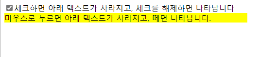
<input type="checkbox" />체크하면 아래 텍스트가 사라지고, 체크를 해제하면 나타납니다
<div id="button1">마우스로 누르면 아래 텍스트가 사라지고, 떼면 나타납니다.</div>
<div id="text">
<h1>Lorem ipsum</h1>
<p>대통령으로 선거될 수 있는 자는 국회의원의 피선거권이 있고 선거일 현재 40세에 달하여야 한다. 예비비는 총액으로
국회의 의결을 얻어야 한다. 예비비의 지출은 차기국회의 승인을 얻어야 한다. 제2항과 제3항의 처분에 대하여는 법원에 제소할
수 없다. 국회는 국가의 예산안을 심의·확정한다. 공무원의 직무상 불법행위로 손해를 받은 국민은 법률이 정하는 바에 의하여
국가 또는 공공단체에 정당한 배상을 청구할 수 있다. 이 경우 공무원 자신의 책임은 면제되지 아니한다.</p>
</div>
</body>
</html>input[type=checkbox]:checked ~ #text{height : 0px;}
-> 체크박스가 체크상태가 되면 text태그에 있는 글들이 사라짐 (높이가 0px가 되므로)

●▶ border(테두리) 속성 -> border에 의한 선 굵기는 div 또는 박스모델의 전체 크기에 합산되어 관여합니다.
-border-width 속성
⊙ 테두리의 너비를 지정하는 스타일 속성
⊙ 크기 단위 : border-left[top/right/bottom]-width
⊙ 키워드 : medium/thick/thin...
-border-style 속성
⊙ 테두리의 형태를 지정하는 스타일 속성
⊙ border-left[top/right/bottom]-style
-border-color 속성
⊙ border-left[top/right/bottom]-color
-border-radius 속성
⊙ CSS3에서 추가된 속성
⊙ 테두리가 둥근 사각형 또는 원을 만들 수 있다
⊙요소 하나만 쓰면 네개의 모서리에 동시 적용, 네개 나눠쓰면 각각 지정된 위치에 적용
border-radius 값을 네개로 넣었을때 적용 순서 : 왼쪽위 -> 오른쪽위-> 오른쪽아래->왼쪽아래
<!DOCTYPE html>
<html>
<head>
<meta charset="UTF-8">
<title>12_Border.html</title>

<style type = "text/css">
	.box1{ width:500px; height:80px; background:yellow;
		border-left-width : thin;
		border-right-width : 15px;
		border-top-width : thick;
		border-bottom-width : 20px;

		border-left-color : green;
		border-right-color : red;
		border-top-width : black;
		border-bottom-color : #0000FF;

		border-left-style : solid;
		border-right-style : double;
		border-top-style : dotted;
		border-bottom-style : dashed;
		}

	.box2{width:400px; height:150px; border:5px solid blue;
			border-radius : 50px 100px 70px 30px; }

    </style>
</head>
<body>

<div class = "box1"><h1> Lorem ipsum dolor amet</h1></div>
<br/>
<div class = "box2"><h1> Lorem ipsum dolor amet</h1></div>
</body>
</html>

●박스 모델 구성요소
-padding : 박스 내부의 구성내용(이미지, 텍스트 등)과 border 사이의 공간(내부여백)
-border : 윤곽선
-margin : 외곽선과 다른 개체 사이의 공간 (외부여백)
<!DOCTYPE html>
<html>
<head>
<meta charset="UTF-8">
<title>13_BoxModel.html</title>
<style type = "text/css">
 	.box{ width:170px; height:100px; border:10px solid blue;
 	margin-bottom: 30px; padding-left:30px; padding-top:30px;}
 	/* padding값은 전체 크기에 합산됩니다. 따라서 box의 실제 크기는 width/height + border + padding이며
 		width : 220px, height : 150px 로 봐야합니다. */

 </style>

</head>
<body>

<div class = "box">박스모델1</div>
<div class = "box">박스모델2</div>

</body>
</html>